Planet
One of the fastest-growing home mortgage companies in the country, Planet originates and services loans for buyers across the United States. We created a planet archetype to represent the company’s expanding diversified interests.
More soon…

One of the fastest-growing home mortgage companies in the country, Planet originates and services loans for buyers across the United States. We created a planet archetype to represent the company’s expanding diversified interests.
More soon…

In September 2026, the international aid organization Mercy Corps will rebrand as Prosper Global. We developed the new name that resonates with the organization’s mission and a bold new visual identity that is at once a directional arrow and a heart, suggesting coming together, compassion, and moving forward.
With over 95,000 members and serving almost 700,000 runners, New York Road Runners is the world’s premier running organization. We created a bold new mark as the centerpiece of a redesigned identity system—an abstract, dynamic torch, which resonates with the pinnacle of the TCS New York City marathon identity, aligning the organization with its marquee event.


For the Association of Tennis Professionals, the global governing body of men’s professional tennis, we designed a bold, dynamic identity system, featuring at its center the abstract swoosh of a high-velocity tennis ball. The ATP acronym is now an icon—streamlined, aspirational, easy to use, easy to wear—an emblem that every audience can infuse with their own connection and relationship to the sport.


Baycurrent is a leading Japanese business consulting firm with a core purpose of forming the front line of change as a vanguard for positive and effective business development.
The new visual identity we created emphasizes the forward-looking mission of the company, with dynamic letterforms spelling out the distinctive name. The primary version of the logo appears in an electric blue, chosen as a vibrant and modern differentiator. In the year to come, Baycurrent will roll out the new identity with high-profile sports sponsorships.
The first woman-owned multi-team global organization dedicated to women’s soccer and athletics, Kynisca is the ownership team behind Washington Spirit, Olympique Lyonnes, and London City Lionesses. The organization also offers a transformative nonprofit, world-class research and training center for women’s sports, accessible to the public with the Kynisca Insights Hub app. Kynisca is led by businesswoman, investor, and philanthropist Michele Kang.
The visual identity takes inspiration from the energy of athletics and particularly soccer—a dynamic, vibrant, kicking K. Paired with a distinctive, streamlined lowercase wordmark, the identity is bold, vivid, and appropriate for this trailblazing brand.
Owner of some of the most iconic American food brands, such as Cinnabon, Carvel, Jamba Juice, and Auntie Anne’s—with over 6,000 retail locations in over 60 countries—was formerly known as Focus Brands. As a strategic move to strengthen the corporate brand, we worked together with Brand Federation to undertake a complete brand overhaul, from a new name to a bold new visual identity.

July 4, 2026 marks the 250th anniversary of the signing of the Declaration of Independence in the United States. The inspiration for the dynamic America250 mark comes from the idea of ribbons, which signify commemoration, celebration, and purpose.

The identity for the new 24/7 news service—the first major platform to stream live news—brings the two established brands together in the familiar CNN red. Equal inlines and a basic geometric holding shape reinforce a unified visual impression. The service will include bespoke programming along with additional familiar shows featuring the most notable worldwide CNN anchors and correspondents.

A comprehensive rebranding effort repositions a century-old metals recycling company, previously known as Schnitzer Steel Industries, Inc., at the center of the circular economy, with a new name—Radius Recycling—and a vibrant visual identity that evokes renewal and the first letter of the new name.
For the reintroduction of the longstanding HLN network as a destination for fans’ beloved drama shows, true-crime series, and more, the new visual identity puts the emphasis on the three letters—each drawn with a bold outline as a frame, and then joined together to form a single impression along with the tagline we created: We Play Favorites.
A new identity for Warner Bros., one of the world’s leading entertainment companies, reimagines the classic 1948 Warner Bros. shield, with refined geometry, streamlined curves, and bright colors. An extensive brand architecture was developed, featuring strong sans serif, all-capital letters for the wordmarks, drawn to accentuate the curvature of the rounded letterforms and resonate with the updated WB letters in the shield.
TNT Sports is a premium international sports brand in Latin America, U.K., Ireland, the U.S., and Europe. Building on the graphic properties of the lettering in the TNT design, which features an uncommon combination of round and angled corners in the same letter, a specially drawn typeface was created, combining straight and round angles in which each letter has at least one curve.
The largest construction and engineering company in the United States, Bechtel Corporation is one of the most influential privately held, family-run businesses in the world. The new logo is an evolution of the Bechtel bug, first design in the 1940s, maintaining the shape and footprint of the original mark. It puts the emphasis squarely on a modernized rendition of the well-known Bechtel name. The circle silhouette is no longer a representation of the globe, but instead an open form, designed to be welcoming, timeless, and strong, reflecting the company values of focus, completeness, and inclusivity.
Every year, the TCS New York City Marathon brings more than 50,000 athletes from over 130 countries and nearly two million spectators to the streets of the city. Our identity design update features five bold stripes converging into a dynamic silhouette of Lady Liberty to represent the five boroughs of the city through which the marathon route always runs.

In 2023, Warner Bros. celebrates its 100th Anniversary. To mark the milestone of 100 years, the company has launched a campaign involving every division of the studio, united by the tagline “Celebrating Every Story” and by a specially created anniversary logo. The logo combines the newly redrawn Warner Bros. Discovery shield we created, and a bold 100 graphic in a dramatic composition. The 100th Anniversary campaign will be celebrated throughout 2023 and beyond.
For the new last-mile courier company Sendeo, we designed a dynamic symbol suggesting sending, receiving, and speed. In lively shades of green and blue, the new brand stands out as modern and youthful in the Turkish delivery market.
For this industry leader, we created a redrawn crown and anchor and a modified name, both of which help to clarify the distinction between the corporate brand and its flagship cruise line.
The Culinary Institute of America is the world’s premier institution of higher education dedicated to food. The new symbol grows out of the historic identity and its core concept of a sheaf of wheat, adding allusions to fire and an open book. With an updated color palette that brightens the green and gold hues, the identity now balances seriousness and vibrancy to represent this dynamic institution.
The identity for the new entertainment giant Warner Bros. Discovery reflects a creative powerhouse of storytelling that builds on its history and its unmatched talent and vision for the future. A distillation of the classic 1948 Warner Bros. shield—a universal symbol of cinematic creativity—the updated mark features reductive geometry, streamlined curves and bright colors. A strong sans serif, all-caps wordmark resonates with the symmetrical structure of the modernized shield.
Panda Global is the premier one-on-one esports team, with regular champions in fighting games such as Super Smash Brothers and Street Fighter. Founded in 2015 by former champion players around the principle of putting the player first, Panda is one of the fastest growing and strongest esports brands in North America. Geometric, modular, and charismatic, the new Panda Global symbol is the face of a panda in a double-outlined hexagon, with rectangular ears that run parallel to its rectangular eyes.
Togg is a major new technology company founded in Turkey, whose first product will be electric vehicles for the local and international markets. The design strategy was to create a symbol of intersection and direction, with mobility and connectedness for the user at its core.

One of the fastest-growing American fintech companies, Network Capital provides mortgage lending and servicing to homeowners and homebuyers. The new Network Capital symbol is an elegant yet bold design evoking the letter N in a bright orange color.
Truveta is a new startup at the intersection of healthcare and technology with the vision of Saving Lives with Data. Truveta’s healthcare system members care for tens of millions of people and provide more than 15% of all clinical care in the United States. The new symbol for Truveta balances the world of nature and the world of data.
The broad holdings of the Discovery parent company include beloved brands such as Food Network, ID, Animal Planet, HGTV, TLC, Travel Channel, Oprah Winfrey’s OWN, and Eurosport, as well as the namesake Discovery Channel. discovery+—the new direct-to-consumer streaming service—will offer familiar beloved content as well as exclusive original programming from the brands across the portfolio. A new bold symbol was created to mark the breadth of discovery+.
Founded in Bangalore in 2010, Practo has grown by leaps and bounds to become one of the world’s largest healthcare platforms. It provides software and apps to connect doctors, patients, pharmacies, and insurance, as well as to manage healthcare on the patient level, clinic level, and hospital level. Today Practo operates in 15 countries, helping patients and providers set over 50 million appointments per year.
Building on a new positioning, communications strategy, and brand architecture, the new visual identity is a bold, simple type treatment made distinctive by its relationship to the circles at each end, representing connections made possible through Practo.
One of the leading global relief and development organizations—a merger between Lutheran World Relief and IMA World Health—needed an identity and a visual representation that could symbolize its combined efforts and unite the different workforces worldwide.
Building on a new name, positioning, and communications program developed by Brand Federation, Chermayeff & Geismar & Haviv created a symbol and a visual identity program that can help unify the various parts of the new organization and increase its visibility and impact. The new identity system will be a flexible and consistent tool for a life-saving global mission.
COLORADO SPRINGS, Colo. – The United States Olympic & Paralympic Museum unveiled its new logo as part of the ongoing brand development ahead of its grand opening later this year. The new five-stripe design will complement the existing logo used by the Museum.
“The new logo for the U.S. Olympic & Paralympic Museum represents a blend of classic influences and modern trends,” said USOPM CEO Christopher Liedel. “The Museum experience merges the tradition of the Olympic and Paralympic Games with state-of-the art technology to tell the inspiring stories of Team USA athletes in a compelling way, and this logo is reflective of that balance.”
The new logo for the Museum takes its colors from both the Olympic rings and Paralympic agitos, its stripes from the American flag, and the diamond silhouette from the building’s façade. Together, these elements suggest an abstract flame and create a connection to an iconic symbol of the Olympic and Paralympic movements. While inspired by these familiar elements, the design is an original image, giving the USOPM its own independent identity. The dynamic, colorful symbol is balanced by a refined, elegant wordmark, stacked to give equal weight to each important element of the name. The logo was designed by award-winning graphic firm Chermayeff & Geismar & Haviv.
The Museum’s existing logo includes the Olympic rings and the Paralympic agitos and will be used as well as an important connection to and celebration of the legacies of these iconic institutions and movements.
“The challenge here was to draw inspiration from the Olympic and Paralympic Games and from the American flag — two of the most famous identities in the world — while still creating a new and original mark,” said Sagi Haviv, partner and principal designer at Chermayeff & Geismar & Haviv. “It’s been an honor to work with this new institution that celebrates excellence and achievement in all of its forms.”
Located in southwest downtown Colorado Springs – Olympic City USA – the U.S. Olympic & Paralympic Museum will be one of the most accessible buildings in the world. The Museum will feature state-of-the-art technology throughout the 13 galleries, which will give guests a holistic journey of athletes and the Olympic and Paralympic Games.
With construction complete, the U.S. Olympic & Paralympic Museum now has the temporary certificate of occupancy for the 60,000-square foot structure. The focus will remain on exhibit instillation and operationalizing the Museum ahead of its official opening.
Visit USOPM.org to learn more about the U.S. Olympic & Paralympic Museum.
A major mixed-use development in Frisco Texas, Fields will feature residential, resort, higher-education, light-industrial, dense urban, business, and retail elements. The identity for Fields captures some elements of this landscape: open sky and wide land. The curved “F” of the symbol suggests an intersection of the rivers and thoroughfares of the development.
Impossible Aerospace is a start-up company in Sunnyvale, California working to shift aviation from hydrocarbon fuel to electricity. Its first product is a battery-powered drone with four times the standard flight-time for electronic aircraft. Impossible Aerospace is built to meet—and to become the benchmark for—the high technical standards of the first responder community.
For a company with big aspirations, the visual identity had to be designed with an eye both to the near term as well as the long term. Solid and indestructible, yet light and open, the new geometric symbol is formed from a single black line. The shape suggests a variety of appropriate ideas, such as an aircraft, arrows, or a star.
Since 1990, Dick Wolf and his production company Wolf Films have dominated television drama. As the company expands into digital markets with multi-platform offerings, the brand will now be known as Wolf Entertainment, with a new visual identity. This new identity juxtaposes the name Wolf set in a bold, classic lettering style with a white circle—an evolution and distillation of the familiar production card.
Flatiron is a healthcare technology company providing software and data analytics services to the FDA, cancer researchers, and care providers. Early investors include Google Ventures, First Round Capital, Roche and others. The new symbol for the company emphasizes the precision and collaboration at the heart of the Flatiron vision. The company relies on its partnerships: between researchers and providers, between technology and oncology, between engineers and physicians.
Mercy For Animals is an international nonprofit organization that conducts undercover investigations of factory farms and slaughterhouses, engages with corporations to create animal welfare policies, and raises public awareness about animal suffering.
The visual identity for the organization was redesigned as a simplified and highly abstract mark. No longer a representation of specific animals, the new symbol for Mercy For Animals is a blue circle bracketed by orange curves. It can be seen as representing the earth being guarded and protected. The symbol also suggests an eye, in an abstract form that can be either human or animal.
Pew Research Center is the leading nonpartisan, independent research institution whose mission is to inform the public about the issues, attitudes and trends shaping America and the world. The Center has several focuses of study, which have in the past functioned as semi-independent research centers. Recently, it was decided to merge these “sub-brands” to help give more prominence to the Pew Research Center brand. In order to help increase the Center’s visibility, a bolder visual identity system was needed.
The visual identity system is grounded by a symbol that suggests illumination, as befits an organization that sheds light on important social and political trends through data. A proprietary color palette helps to distinguish the various research activities, while uniting them under the main Pew identity.
With 29 campuses in 25 cities across Mexico, the Universidad Tecmilenio is a private university that prepares students for meaningful employment. Tecmilenio’s unusual and flexible program focuses on the happiness and fulfillment of its students, and the new visual identity embodies this idea of individual aspiration. The overall shape evokes many relevant associations: the individual, divergent paths each student takes, an abstract tree suggesting growth and renewal, and the letter T.

A joint-venture between Anheuser-Busch InBev and Keurig Dr Pepper, Drinkworks is a beverage innovation company whose initial offering, the Drinkworks Home Bar by Keurig®, is a first-of-its-kind drinkmaker designed to prepare cocktails, wine, brews and more by using proprietary Drinkworks Pods. The new symbol—seven circles uniting in a round—invokes the company’s core message of bringing people together.
Renowned record executive LA Reid and entrepreneur Charles Goldstuck founded Hitco Entertainment to create, produce, record and distribute new music and artists. Among the projects of the new entertainment label—in addition to a stable of artists including Big Boi, DJ Holiday, Klondike Blondie, and Yella Beezy—is a new deal with Pilgrim Media Group to develop and produce music-focused shows. One of the first projects will be a documentary focusing on the music scene in Atlanta.
The new symbol for Hitco features a bold H letterform, created by the joining together of two #1s—a meaningful image for a partnership dedicated to producing chart-topping music. The bright, warm colors lend panache to the geometric form.
In Fall 2018, Animal Planet is launching a comprehensive new brand identity, centering the network’s programming around the childhood joy and wonder of animals by bringing people up close in every way. The channel is currently in 360 million homes in more than 205 countries and territories. Animal Planet blends personal connections with animals and powerful natural-history storytelling.
The historic Animal Planet logo—an elephant with the globe—retained a great deal of recognition and affection. Moreover, the core concept was appropriate, as an elephant is a majestic, exotic, and intelligent animal, wondrous enough to represent the entire animal kingdom. In this fresh and distinctive rendition, the new leaping elephant captures the joy and energy of the beloved Animal Planet brand.

This new book features over 100 case studies from previous and current clients, including Chase Bank, NBC, PanAm, PBS, as well as the US Open Tennis Championships, Conservation International, Dominion Energy, Harvard University Press, and many more. Also included are interviews with Tom Geismar and Sagi Haviv, plus written contributions from Milton Glaser, John Maeda, and others.
Published by Standards Manual
The Arthur Ashe Stadium is the centerpiece of the USTA Billie Jean King National Tennis Center, home to the world-famous US Open Tennis Championships. A new, lightweight retractable roof was added to the stadium in 2016.
In 2018, as part of a major fiftieth anniversary initiative that included state-of-the-art facilities improvements, the USTA commissioned a new identity for Arthur Ashe Stadium. The elegant wordmark evokes the silhouette of the architecture and the building’s retractable roof. The new Stadium identity will increase the visibility and distinction of Arthur Ashe’s name to help expand public recognition of his distinguished legacy.
Apollo Global Management is the second largest American alternative asset management firm, with over $280 billion invested.
The new Apollo visual identity builds on the historic mark and green color. An elegant, streamlined wordmark was created in a new, more vibrant shade of green, and a complete overhaul of the firm’s print materials and digital assets was developed.
On the occasion of the 50th anniversary of the US Open, the US Tennis Association decided to reinvent its visual identity. The new mark is an evolution of the core concept of a flaming ball, distilled to its essence to work as a simple icon. The new modern symbol is paired with an italic, lowercase sans serif typography. The resulting identity expresses the energy, spirit, and velocity of this fourth and final Grand Slam—the world’s most-attended sporting event.
Jetpack supercharges WordPress, the free and open-source content management system that powers nearly 30% of websites worldwide. We worked with the Jetpack team to streamline their visual identity, redrawing both the logotype and the symbol.
ClearMotion makes a next-generation suspension system for automobiles and trucks that eliminates shocks when you drive.
The symbol is a pair of rising rings that is inspired by “laminar fluidity,” the central idea behind the technology.
The Oceano Azul Foundation is an international organization founded by the Sociedade Francisco Manuel dos Santos and based in Portugal with the mission of contributing to the sustainability of a healthy and productive ocean. Combining scientific study, political and economic activism, together with a deep ethical commitment, the Foundation integrates many human perspectives to “look at the planet’s sustainability from the ocean’s point of view.” The Oceano Azul Foundation manages the Oceanário de Lisboa, for which Chermayeff & Geismar & Haviv designed the visual identity, as well as major tile murals.
Inspired by an element of the Oceanário’s trademark, the visual identity for this new organization is a bold symbol that combines the image of a fish with water. The waves suggest layers, or currents.
The 100th birthday of composer, conductor, and music educator Leonard Bernstein will be celebrated from August 2017 to August 2019. The symbol joins the Bernstein name with the concept of music for new generations of audiences who may not be as familiar with this luminary’s impact and legacy. Major events, concerts, and festivities are planned around the world—1,000 events taking place on six continents.
Dominion is one of the nation’s largest producers and transporters of energy. A Fortune 500 company headquartered in Richmond, Virginia, Dominion serves more than 6 million utility and retail customers throughout the Eastern U.S. and the western Rockies.
As part of a strategic rebranding that changed the name from Dominion Resources to Dominion Energy, the new trademark evolves out of the company’s visual tradition and provides continuity with the key elements of the established brand: a rising D, the color blue, and the concept of energy.
On January 1, 2017, the new Fortune 500-scale company Conduent was born, and its leadership rang the bell on the New York Stock Exchange at the opening of the trading year to mark the occasion. A completely independent spin-off from Xerox, Conduent has a significant share of the business-process outsourcing market: for example, they handle medical benefits for 15 states, 40 percent of worker’s compensation payments, and nearly half of the nation’s highway toll systems.
The new company needed a visual identity that would establish the brand quickly for its various audiences and would be distinct both from previous corporate entities and from the rest of the sector. The Conduent symbol is composed of three parallelograms coming together, representing the relationship between Conduent, its clients, and their customers. This configuration creates a forward-pointing arrow at the core of the design. Together with a bold, confident wordmark, the visual identity stands for a trusted, experienced company poised to hit the ground running.
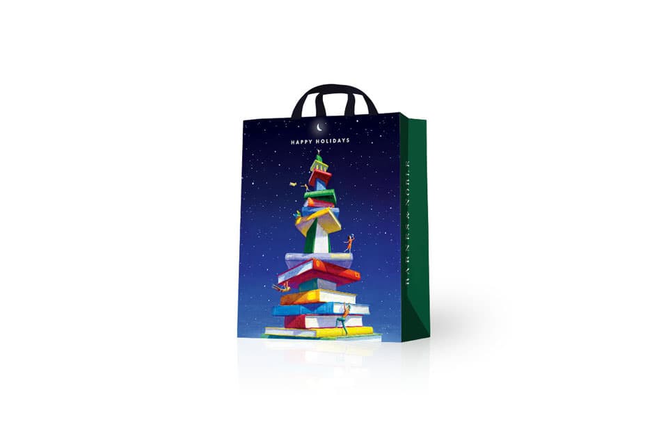
Barnes & Noble’s 2016 holiday theme shows a fantastical tower of books with something for everyone under the midnight sky. The theme is applied to seasonal shopping bags, signs, gift cards, and wrapping paper.
Illustration by Allen Garns.
For more information, please contact Chris Nutter at christopher@nuttermedia.com.
As part of the broader reconsideration of the Tecnológico de Monterrey visual identity, Chermayeff & Geismar & Haviv redesigned the university system’s athletics brand, “Borregos” (rams). Previously, the brand had been scattered across campuses and sports into disparate logos and identities, presenting a lost opportunity to promote the university and branded merchandise across Mexico. Additionally, the various previous marks were not rendered effectively, and the most widely used ram’s head design looked like a bull.
The new Borregos ram’s head logo replaces all existing designs. Building on elements familiar to student athletes, the new design is cleanly rendered and functions effectively with the new Borregos wordmark. A three-letter abbreviation for each campus combines with the new logo to create a complete and customized system for differentiating the various teams. With new uniforms, helmets, signage, and promotional materials for every sport and campus, the cohesive new identity will enhance the visibility and prestige of the university’s presence across the nation and beyond.
Further information about the Borregos athletics program can be found here.
The Mexican broadcast television market has long been dominated by two giants: Televisa and Azteca. In 2016, a third media brand joined them: Imagen. Imagen unites several major online, print, radio, and television brands under a single banner, with programing in news, entertainment, sports, lifestyle, and so forth. The new media conglomerate will reach 124 major cities around the country—around 91% of the total population.
Highlighting the company’s central theme of inclusion and diversity, the new symbol brings together two fundamentally different geometric shapes to create a letterform.
With over ten million members, Course Hero is an educational online platform where college students and educators can share and access course-specific content, notes, and study guides, tools such as sample quizzes and tests, and services like tutoring and interactive flashcards.
The new mark is an evolution of the previous one, carrying over the idea of a shield—appropriate both for the concept of a hero, and for higher education. Combined with an open book and a central star, the new abstract shield also suggests a new degree of seriousness. The traditional serif lettering for the name helps add authority to the identity.
Founded in Japan in 1899, the Yoshinoya brand is known in that country for its beef bowls and tradition of efficient service—with over 1,500 restaurants across Japan, and 106 locations in California. As Yoshinoya has expanded into international markets, however, it had some difficulty establishing recognition. The complex, traditional seal posed a challenge—and particularly in American markets, where signage is very important.
Rather than simplifying the existing logo, which contained many elements that were irrelevant or incomprehensible to American audiences, we focused on the distinctive lettering style of the name, extracted the recognizable Y, and set it in a bowl shape. This revised visual identity now works effectively in all applications, from signs to app icons. The new lettermark, in the Yoshinoya Orange, will be adopted in both the US and Japanese markets—alongside the original seal that will continue to represent the long tradition of the brand.
While the Hunter Douglas name is well-known and highly respected within the field of window treatments, shades, and blinds, there was an opportunity to add elegance and distinction to the familiar name by developing an appropriate graphic mark—which could also serve as an anchor for a complex identity system for the multiple services and sub-brands that Hunter Douglas offers. The symbol that Chermayeff & Geismar & Haviv developed—an elegant, bold, geometric mark that suggests the play of light and shade—can be used effectively in all of the many needed applications for the Hunter Douglas brand.
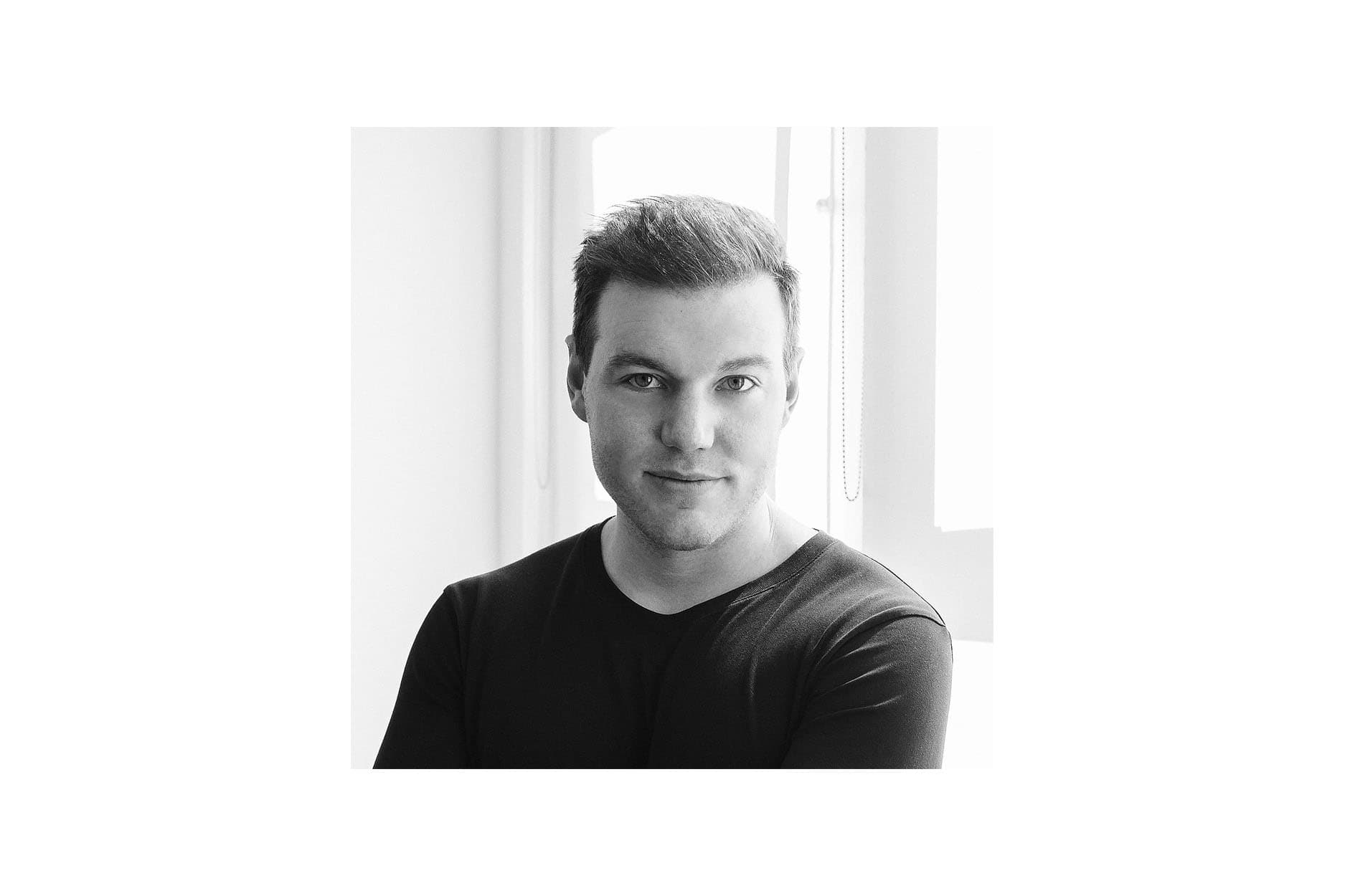
Chermayeff & Geismar & Haviv is happy to welcome new principal designer Mackey Saturday to the team!
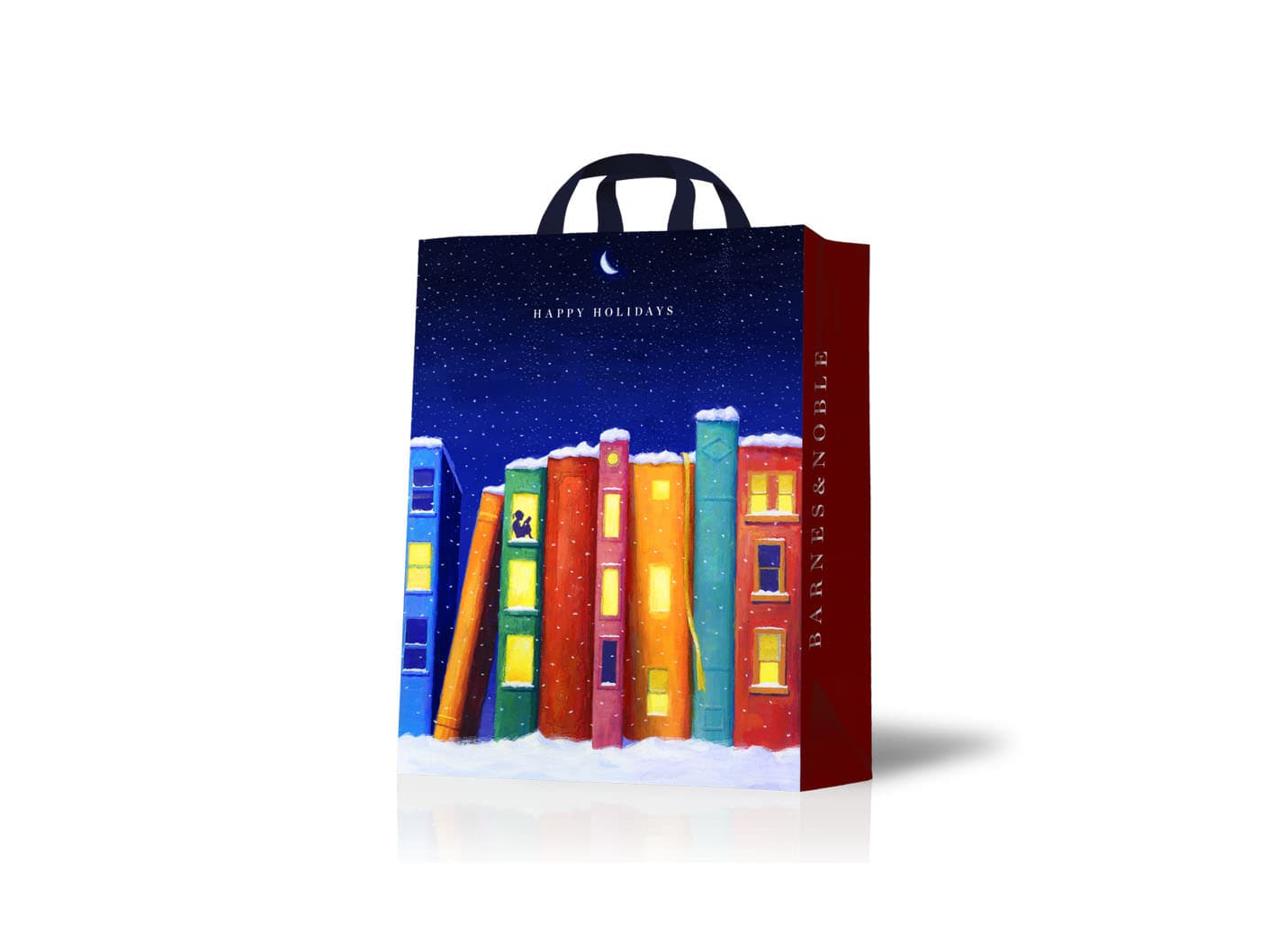
In this design for a variety of holiday assets for Barnes & Noble, books become a snow-covered village by night. A window into the warm interior shows a young girl reading a book.
Illustration by Allen Garns.
Heart of Tea is an all-natural iced tea, created by a New York-based entrepreneur, Masoud Gerami. Chermayeff & Geismar & Haviv developed the vibrant visual identity for the brand, as well as the design of the bottles, labels, advertising, and website. A year after its launch, the tea brand has already become a fixture in major retail venues across the Northeast.
Cooper-Hewitt and the Smithsonian Institution have announced that 2014’s Lifetime Achievement National Design Award will go to Tom Geismar and Ivan Chermayeff.
Founded in 1922, State Farm is the one of largest insurance companies in the United States, providing insurance for property and casualty, life and health, as well as banking and financial services. The previous State Farm logo—unchanged for over half a century— was quite complex, with the words “Auto, Life and Fire” contained within three interlocking ovals, enclosed by a frame.
The renewed State Farm trademark grows out of the foundation of the original, core design of the three ovals. It has been adjusted for symmetry and ease of reproduction. The symbol, along with an updated State Farm wordmark, together create the modern State Farm identity.
Pellucid Analytics is an emerging company founded by a group of young entrepreneurs with deep experience in both finance and technology. The company offers software and services specifically tailored to the data analysis and visual presentation needs of financial and other data-driven consulting sectors. Pellucid is headquartered in Boulder, Colorado and is rapidly expanding.
Founded in 1858, Bemis Company, Inc. is a Fortune 500 company that manufactures flexible packaging and pressure-sensitive materials for major food, consumer products, and healthcare companies around the world. By 2013, Bemis operated 10 decentralized divisions, each of which used its own visual identity and name, some incorporating the name Bemis into their identities and others not.
Chermayeff & Geismar & Haviv’s task was therefore twofold: to design a modern trademark for the Bemis masterbrand, and to create a visual identity system that would enable a more unified Bemis brand architecture. The new trademark captures Bemis’s essence as a material-science company, evoking an atomic model, flexible material, the idea of enclosure, and multiple units coming together.

This piece was designed for the September 11, 2013 op-ed page of The New York Times. The authors of the lead op-ed argue for reforming the Department of Homeland Security to prevent another terrorist attack like those of 12 years before.
The domestic appliance and consumer electronics giant Beko is a significant presence in the European and British markets, as well as around the Middle East and China—particularly among a younger demographic. Worldwide, a Beko-branded product is sold every two seconds. Beko came to Chermayeff & Geismar & Haviv in order to modernize and revitalize its visual identity.The new Beko logotype is youthful and approachable, with an angled underscore that suggests energy and optimism. The blue color in the logo is a brighter shade of the navy blue that Beko has traditionally used. In 2014, Beko entered into a sponsorship agreement with FC Barcelona, one of the most famous soccer clubs in the world, and the new visual identity now appears on team jerseys and stadium signage through 2018.
RatPac Entertainment, a partnership between Brett Ratner and James Packer, won a slate deal with Warner Bros. to co-finance 75 films between 2013 and 2017. Our firm was tasked with creating a logo for RatPac to appear along with the Warner Bros. logo as part of the films’ opening credits. Since, according to Director’s Guild rules, a director’s name must be the first proper name to appear in a film, it was essential to create a trademark that would remain distinctive and could act as a visual shorthand even without the RatPac name.
The design of the RatPac logo fuses together a capital R and P, representing the partnership in a strong, distinctive way. The simple form works well in the motion-graphic signatures required for cinema credits, while the bold overall mark can be easily reduced for digital and print applications. The new RatPac logo will also identify the various divisions of the new media brand: RatPac Documentary Films, RatPac Television, and RatPac Press.
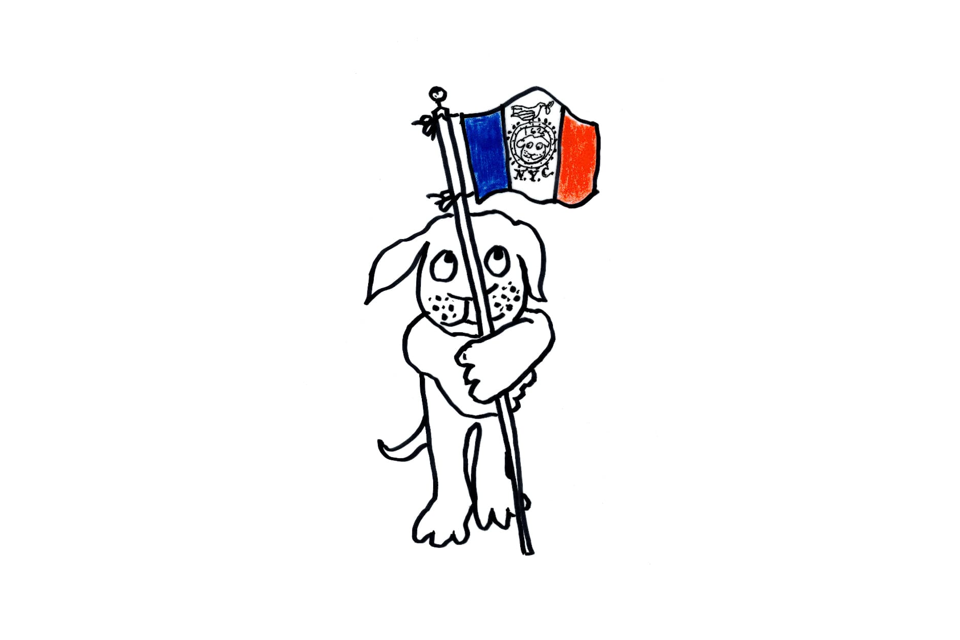
The NYC Landmarks50 Alliance and Sotheby’s invited Ivan Chermayeff to contribute to its benefit auction an artwork that re-imagines the city’s flag for the 21st century. Read an article about the event here.
Until late 2012, the familiar Avery office and consumer products were produced by the consumer-facing division of Avery Dennison Corporation. Then in early 2013, CCL Industries purchased the division and named it Avery Products Corporation.
While Avery Dennison continues to use the red paperclip triangle designed by Saul Bass in 1975, Avery Products Corporation needed a revised visual identity to clearly distinguish it from Avery Dennison and to signal a fresh start to the 78 year-old brand.
The challenge was to find a way to distinguish the “Avery” brand without losing the considerable equity of its strong name and recognition. A tilted red square was a way to make the wordmark distinctive and was also a nod to the way that Avery had been using the historic Bass mark.
Optimism Brewing was founded by husband-and-wife entrepreneurs Troy Hakala and Gay Gilmore to be a more welcoming and approachable kind of craft beer. Most beer branding tends to be macho, stodgy, or snobbish—attributes that Troy and Gay wanted to avoid entirely. Their main location, a former auto dealership in Capitol Hill, Seattle to be redesigned by renowned architect Thomas Kundig, will feature all of their regular and seasonal beers on tap, while they also look to expand the brand’s footprint in retail sales.
In response to Gay and Troy’s vision, Chermayeff & Geismar & Haviv designed a bold visual identity that suggests lightness and positive feeling. The Optimism bubbles look unlike any other beer visual identity and will work in the many different applications that Troy and Gay will need in the years to come.
For decades, Minneapolis-St. Paul residents have relied on the insurance and healthcare facilities of HealthPartners. In the face of a changing healthcare industry, HealthPartners has combined with other Twin Cities providers, including Park Nicollet, another major healthcare nonprofit in the area. A new symbol and graphic system will tie together a range of hospitals and other facilities.
The new HealthPartners identity emphasizes partnership, resonates with the visual history of both HealthPartners and Park Nicollet, and is flexible enough to accommodate a complex brand architecture.
The symbol suggests the relationship of care, with the patients and members in the center. The existing typography was retained in large part because one typeface—Sabon—had coincidentally been used for both HealthPartners and Park Nicollet; the decision will save millions of dollars in signage around the Twin Cities.
The previous logo for the University of New Hampshire featured the clock tower of its original campus in Durham. University officials were convinced that not only did the mark not work in all the digital applications needed for a logo today, but also that the clock tower was too specific to Durham and did not represent the campuses in Concord or Manchester.
Chermayeff & Geismar & Haviv designed this bold, modern shield, which features the university’s traditional colors of blue and white and puts the focus firmly on the NH—thus reaffirming the university as the flagship public institution of New Hampshire.
For the last 40 years, Rare has worked with communities around the world to tackle environmental problems with locally led solutions. Their goal is to inspire people to become proud, careful managers of their local natural resources.
Their most important visual identity challenge was that the existing logo—the word “Rare” with a wave under the letters—didn’t help the organization to clarify its ambiguous name. Although short and easy to pronounce, the four-letter name always prompted questions for the organization’s employees and leaders. In Rare’s past, the initials had stood for “Rare Animals Relief Effort,” but since that was no longer their mission, the acronym had faded away.
The new Rare visual identity is a lively combination of four bold and clearly understood icons: a drop of water, a leaf, a human head, and a fish. Taken together, they also represent food security, climate resilience and livelihood assurances—the interdependencies between people and nature. The new identity is friendly, modern, and approachable, while immediately situating the organization within the conservation realm.
Founded in Ulm, Germany in 1864, Magirus manufactures and outfits firefighting equipment and trucks. A trusted manufacturer and leader in innovation, Magirus invented and patented the first turntable ladder. For most of the 20th century, the brand has been owned by parent companies—first by Deutz, a German engine manufacturer, and since 1975, by Iveco, an Italian truck manufacturer. In 2012, with the permission of its holding company, Magirus decided to relaunch as an independent brand to solidify its market position as one of the finest quality firefighting equipment manufacturers in the world.
The new identity, an articulated M, suggests the ladders for which the company is known. It recalls elements of the historic Magirus-Deutz logo, which combined a stylized M with the sharp spire of the cathedral in Ulm where the company has been located for some 150 years. Both strong and elegant, this new mark can hold its own next to the chassis manufacturer logos and can be used everywhere to identify the independent Magirus brand and carry it into another century.
The global non-profit Women’s World Banking works with financial institutions to develop tools and services for low-income women. In order to clarify their mission and solidify their position, the organization came to Chermayeff & Geismar & Haviv for a serious, modern visual identity—one that puts the emphasis on the full name, rather than the initials.
The new trademark conveys the strength and authority of the organization, while remaining appropriate to its forward-looking, optimistic mission. The simple geometric shapes suggest an opening flower, a coin entering a purse, and a winged figure.
In 2013, the Women’s Tennis Association celebrated its fortieth anniversary and commissioned a special trademark to use throughout the year. Chermayeff & Geismar & Haviv extended the previous visual identity it had designed to include “40 LOVE.”
This re-imagined “H” for the Harvard University Press identity is formed by six rectangles, suggesting books. The overall image also evokes a paned window. The Chermayeff & Geismar & Haviv-designed identity, released in 2013, balances the traditional and the modern.
Euphoria Yachts is a new line of sleek sailing vessels designed and built by Sirena Marine. The trademark that Chermayeff & Geismar & Haviv designed for the brand suggests an active, directional sail. The symbol can also be seen as an optimistic image of a bird taking flight.
Founded in 2006, the online language-instruction company Open English has quickly become a leader in Central and South America, reaching 20 countries and more than 50,000 students. Chermayeff & Geismar & Haviv designed a new visual identity to help the company solidify its position as a respected and innovative ESL education service, and prepare to expand into the global market. The new trademark features a special treatment of the name, supported by a frame that might suggest a digital screen or an open window or door. The mark is modern, friendly, and accessible.
Launched in 1989, New Visions for Public Schools has become one of New York City’s largest educational nonprofits, supporting schools, training teachers, and operating a growing network of charter schools. The three bars of the new visual identity suggest growth, dynamism, the letter V, and climbing steps. It is simple enough to work everywhere, while standing out from the field of educational logos. To underscore the organization’s commitment to working within the public school system, Chermayeff & Geismar & Haviv gave all the words in the name equal emphasis.
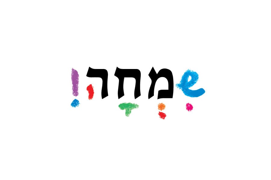
13 international designers were invited to contribute designs on the theme of “a better tomorrow” to the 2012–2013 Haaretz calendar. Partner Sagi Haviv created this image: while the traditional type reads “tomorrow”, with the addition of the freehand, colorful marks, it reads “joy.” See the whole calendar.
The premier association of investment professionals around the world, CFA Institute sets high standards for its charterholders’ credentials and ethics. The CFA Institute needed to establish its own clear identity for its diverse societies and publications, one separate from its primary CFA Charter program.
CFA Institute’s new visual identity unifies seven lined segments suggesting the seven continents. The design visually implies dynamic movement both inward and outwards: the inflow of ideas from the worldwide membership community, and the programs and activities flowing out of a central core.
Motion graphics developed by Thornberg & Forester